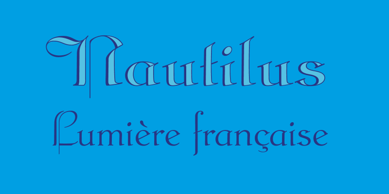
This project is based on the digitalization and reintroduction of two spanish typefaces from the twenties of the last century. They were completely redrawn and their caracter set was amplificated to suite the use in a wide spectrum of languages. Old spanish lead type, almost forgotten come to new life in our modern era.
Discover the processTypemods
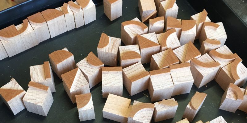
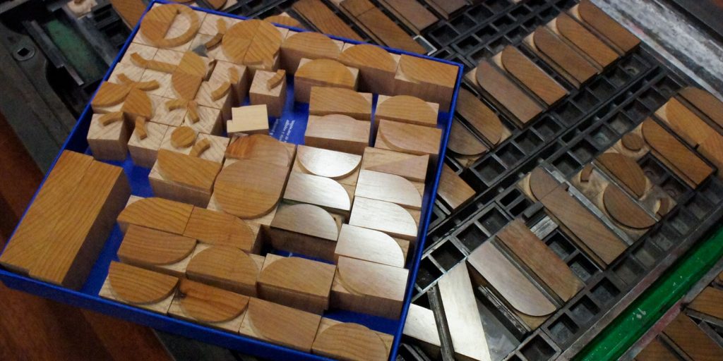
Inspired by different typefaces and lettering from the 1930s in Spain, we created a new modular typographic system: “typemods”, with the aim of allowing its production by means of the CNC milling machine for the use in the Letterpress community.
We introduce a new modular typographic system: “typemods”. A typeface created for digital use that is also a modular system inspired by the typography developed in Spain in the 1930s. With the lettering of Helios Gómez and the “geometric figures” of Esteban Trochut as a starting point, we have created this system of modular blocks, produced in wood using a CNC milling machine, which is available to the entire community of Letterpress printers and workshops in design schools. A typographic universe that offers the user infinite combinations and possibilities.
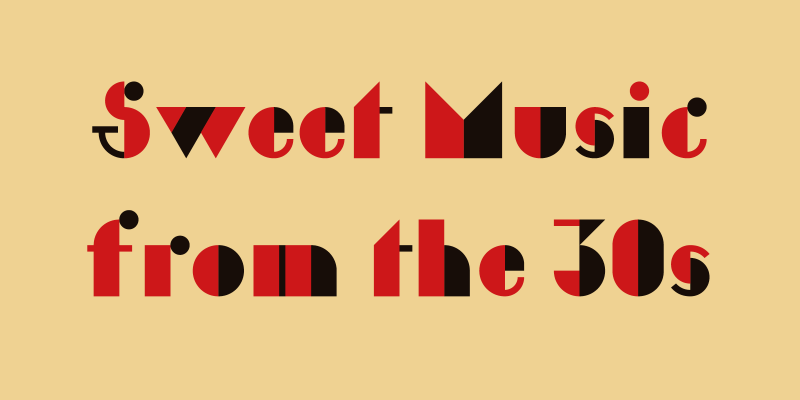
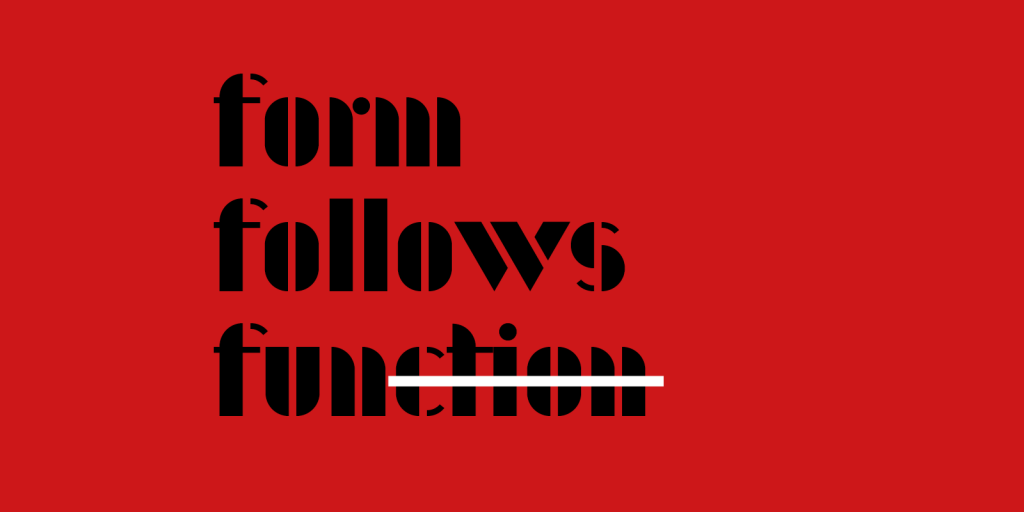
To show the versatility of the pieces, we have created two digital typographies with them: “typemods_stencil” and “typemods_color”.

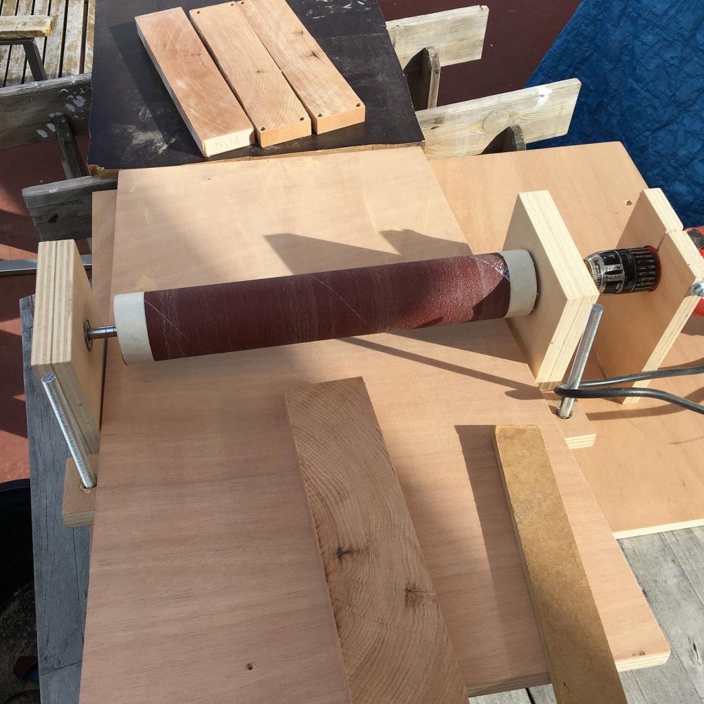
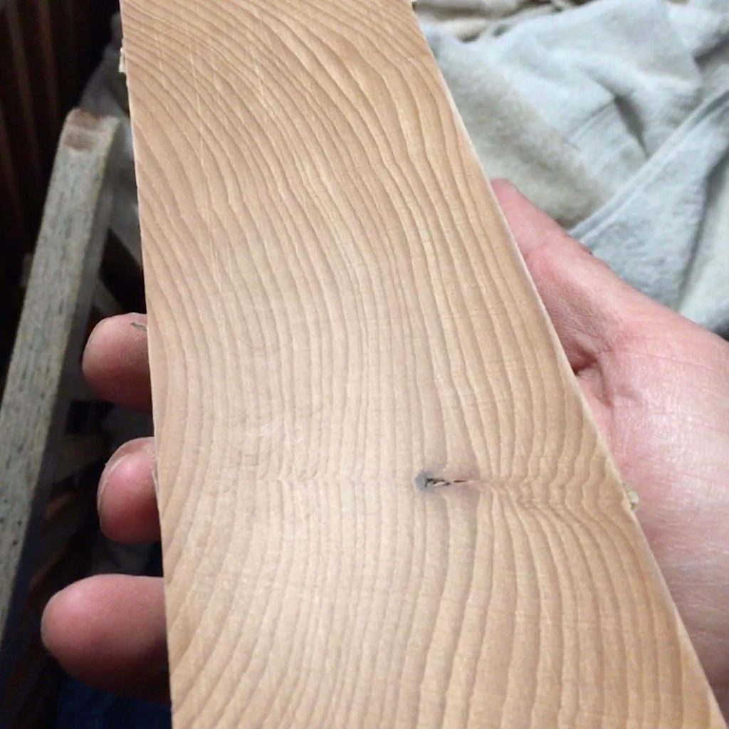
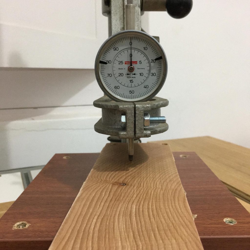
A long and laborious process is the preparation of the wood to an exact height of 23.56mm (+/- 0.05mm) for correct operation on a letterpress. For this, we use a combination of the CNC milling machine and a roller sander with different grades of sandpaper to achieve an absolutely smooth surface. The wood is varnished with shellac and polished with oil and pumice powder.
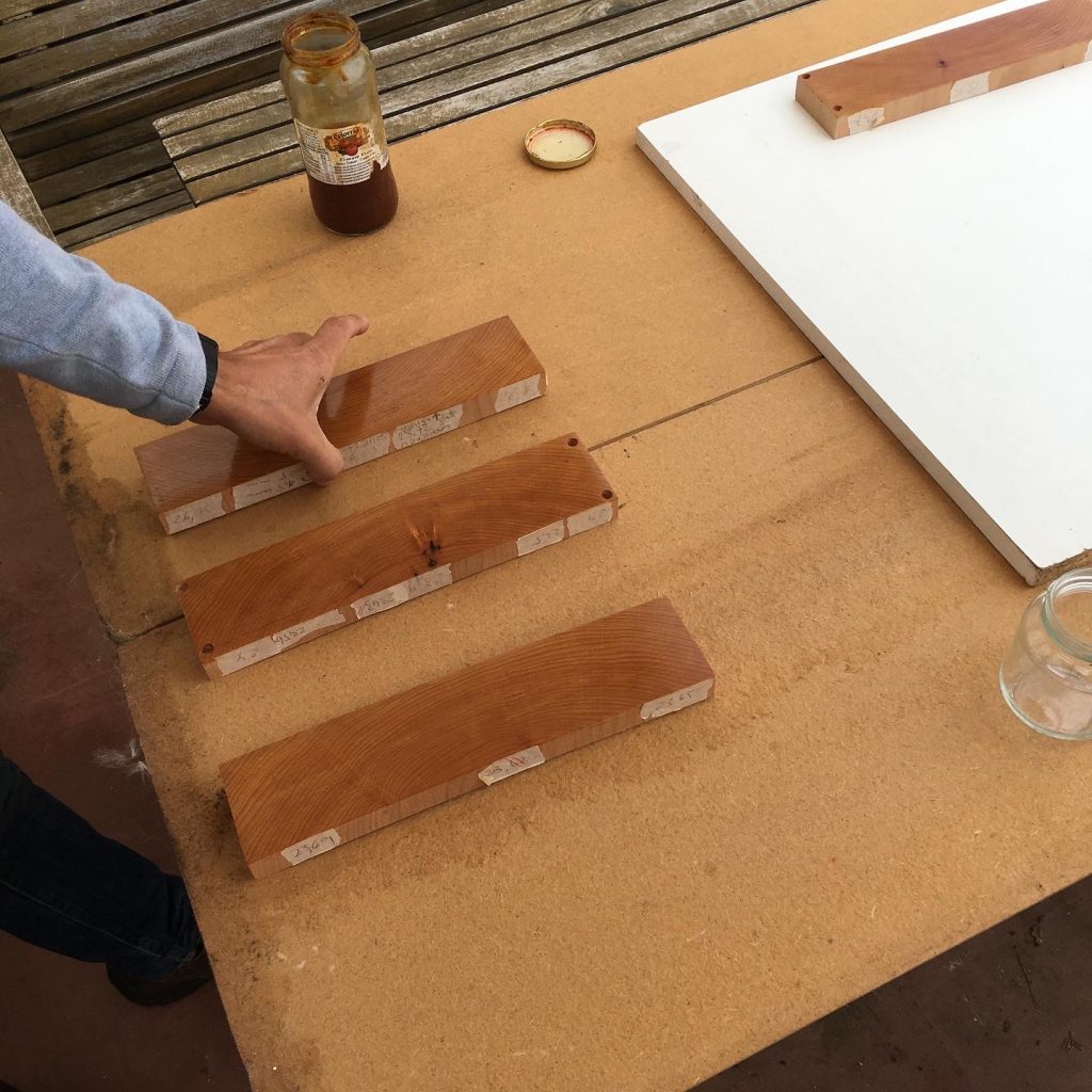
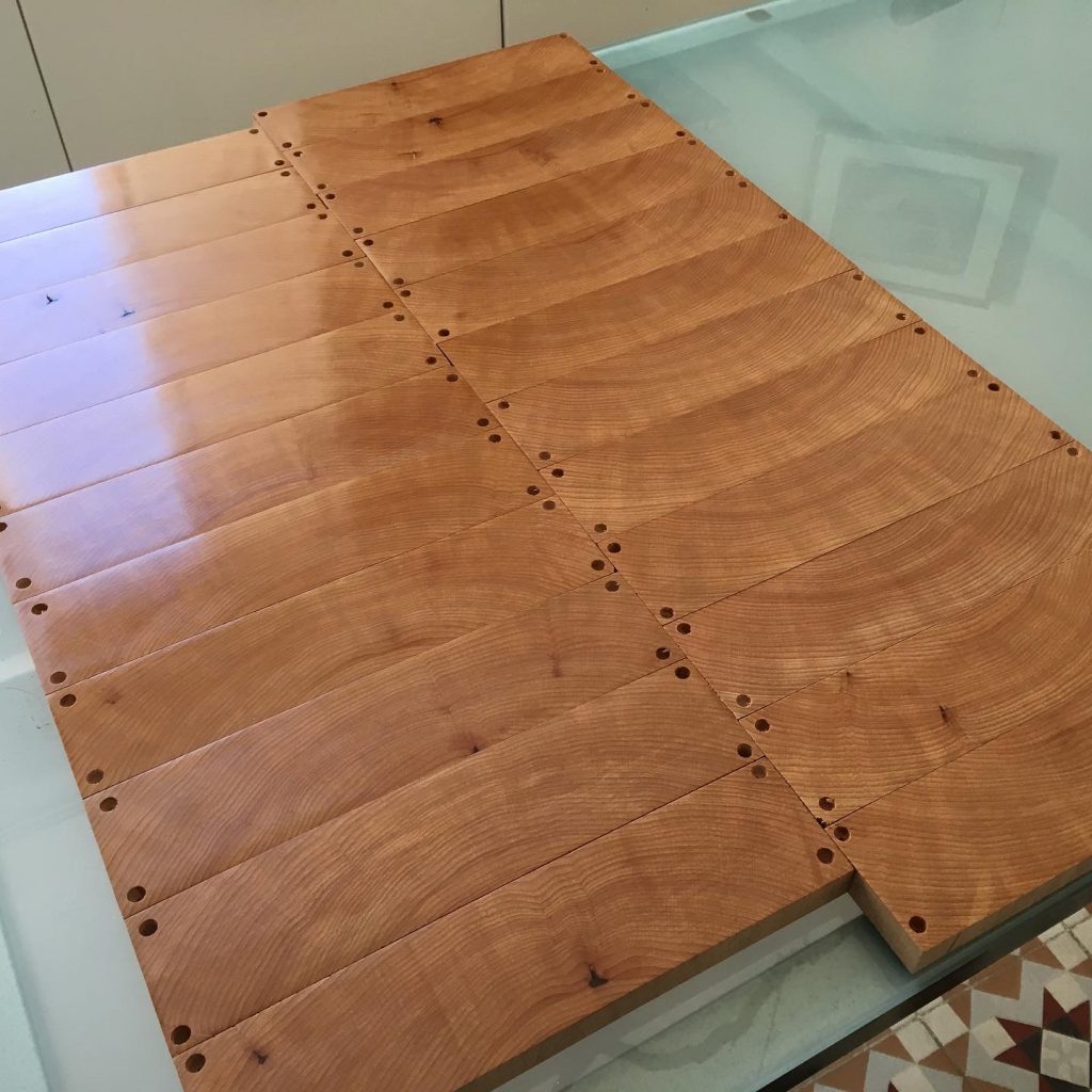
We mill all the modules of the complete typographic system in wood and cut the individual modules to the typographic dimensions using a original printers precision saw.
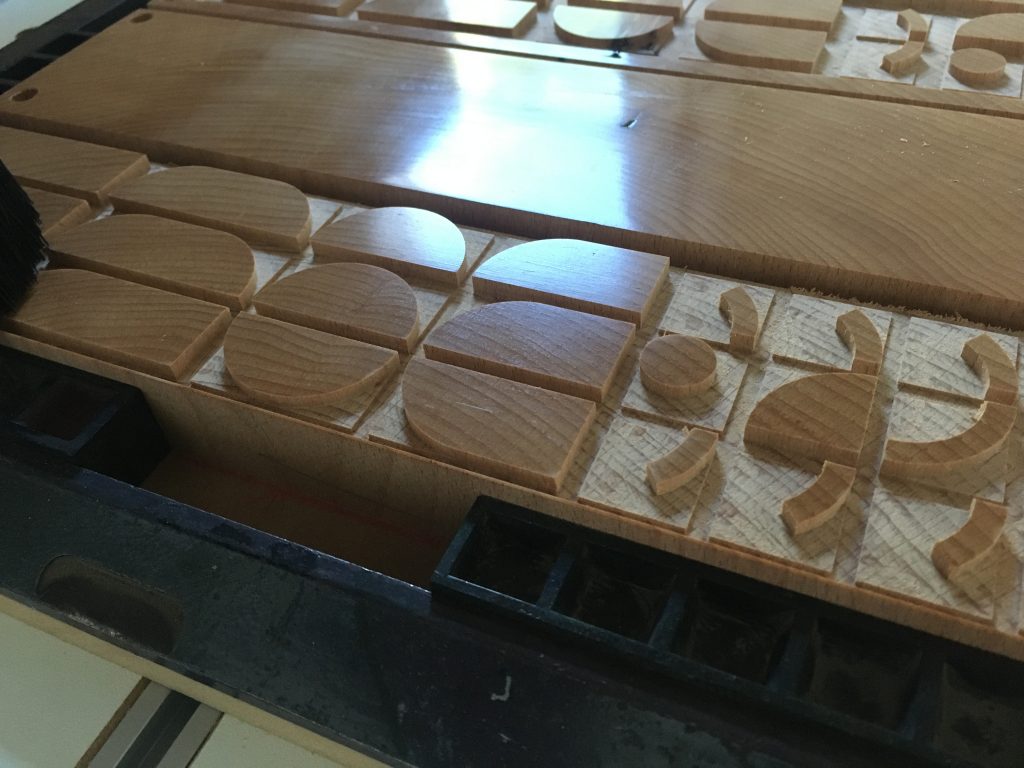
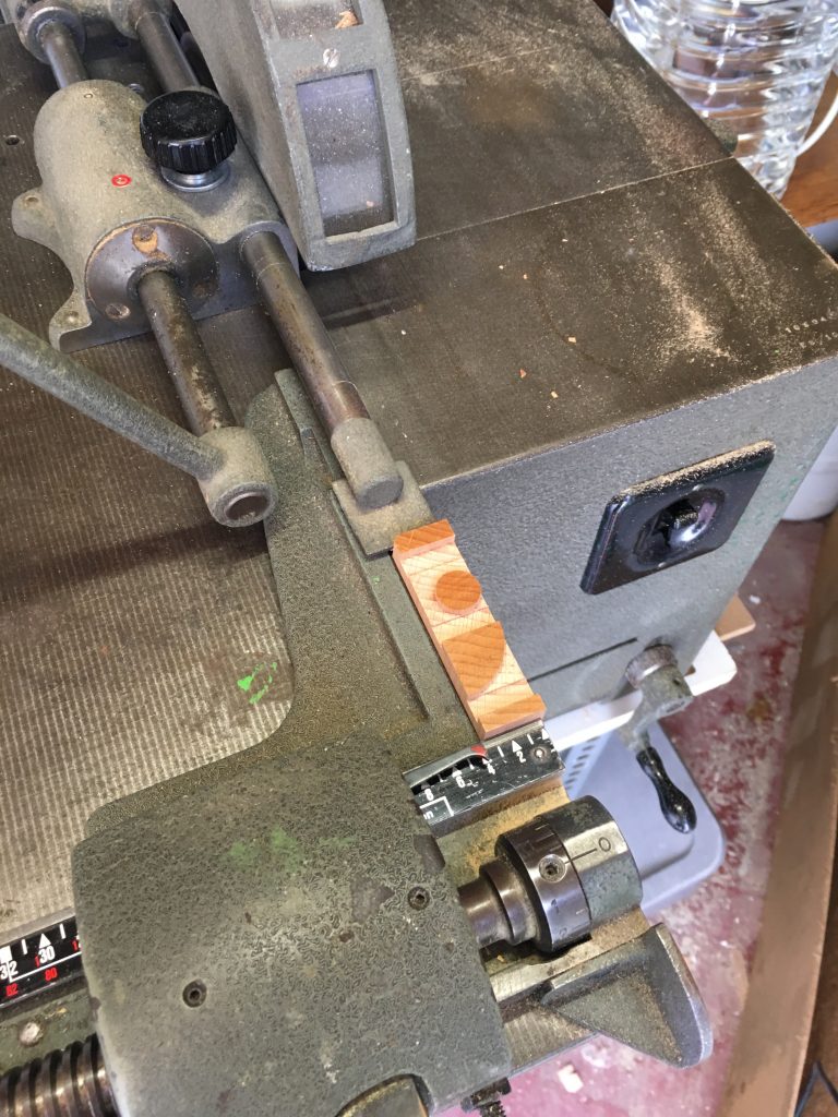
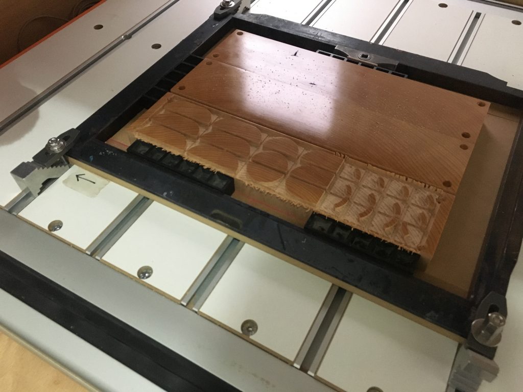
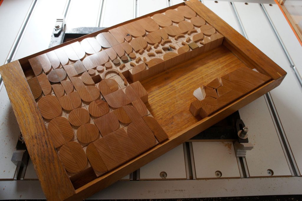
With the spacing material available in our workshop Tipos en su tinta, we compose the “typemods_stencil” typeface with the modules and print specimen.
In our shop you can buy a set of these modules or contact us for personalized orders.


typemods_stencil
This is a sample intro paragraph and can be used to introduce readers to your article.
This is an example of a WordPress post, you could edit this to put information about yourself so readers know where you are coming from. You can create as many posts as you like in order to share with them what is on your mind.
Continue Readingtypemods_color
This is a sample intro paragraph and can be used to introduce readers to your article.
This is an example of a WordPress post, you could edit this to put information about yourself so readers know where you are coming from. You can create as many posts as you like in order to share with them what is on your mind.
Continue ReadingGraciosa
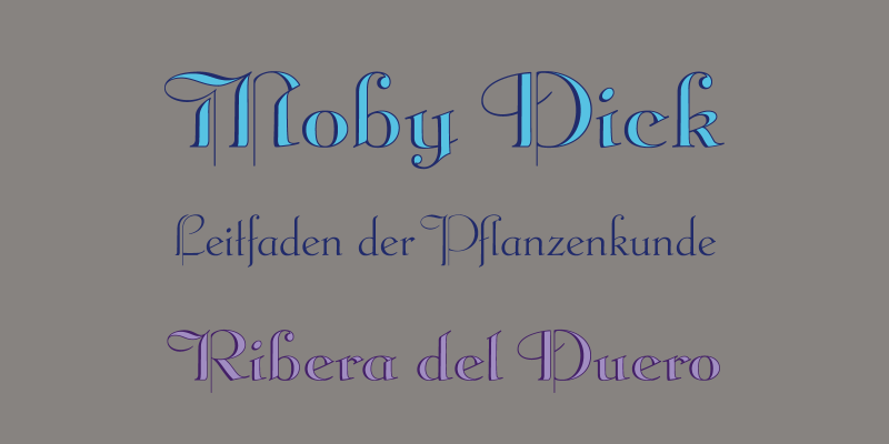
P22 Graciosa is a five font family based upon designs for a metal type by Carlos Winkow (1882–1952), a German type designer who lived and worked in Spain in the early 20th Century. Graciosa is a sort of hybrid blackletter/text font, with simplified blackletter caps and a serifed lowercase with subtle script flare. There is a Regular, Black, an open version called White, and an engraved version called Gris. The version called Multi serves as a fill font to allow for multi-colored layering options.
A revival of these designs was initiated by Matthias Beck in 2015. The character set was expanded for use in 21 languages (OpenType Standard). The digitization and reintroduction of these old fonts—created in Spain and practically forgotten—makes them regain a new life.
As we discovered the history of these fonts, we recovered a full chivalete of old lead typefaces in an old printing press in Tenerife, and among them, a great treasure for us: 10 drawers of Graciosa and Graciosa Gris in all sizes.
Former lead fonts created in Spain and almost forgotten, acquired now a new life. The rise of new information technology opens a new field for these sources and allows us to expand their function indefinitely, creating new ways to use them, while democratizing by making them accessible.
We distribute these typographic via the P22 typefoundry to share this treasure with you all.
Special thanks to Andreu Balius and Jose Ramón Panela for their support and advice in this project.
This project was subsidized by the Spanish Ministry of Education, Culture and Sport.
