This project is based on the digitalization and reintroduction of two spanish typefaces from the twenties of the last century. They were completely redrawn and their caracter set was amplificated to suite the use in a wide spectrum of languages. Old spanish lead type, almost forgotten come to new life in our modern era.
In 2015 we created a digital version of the two lead fonts Graciosa and Graciosa Gris, originally designed by Carl Winkow for the Richard Gans Foundry Madrid in 1922.
The redesign, drawing and development into new symbols for internationalization and adequacy for a wide range of languages was the first and exciting project of Letter Island.
Among the old lead and wood typefaces that we have recovered in our letterpress workshop Tipos en su tinta , we have a particular fondness for an old drawer of lead letters with a typography called Graciosa Gris.
While researching the history of this typography, we discovered the dossier “Carl Winkow. Typographer 1892-1952”, written by Unos tipos duros. As a german living in Spain, showed I took interest in the life and work of Carl Winkow for Richard Gans Foundry. As we discovered the history of these fonts, we recovered a full chivalete of old lead typefaces in an old printing press in Tenerife, and among them, a great treasure for us: 10 drawers of Graciosa and Graciosa Gris in all sizes.
Former lead fonts created in Spain and almost forgotten, acquired now a new life. The rise of new information technology opens a new field for these sources and allows us to expand their function indefinitely, creating new ways to use them, while democratizing by making them accessible.
We distribute these typographic via the P22 type foundry to share this treasure with you all. The Regular style of the Graciosa font is also available on Adobe Fonts
Special thanks to Andreu Balius and Jose Ramón Panela for their support and advice in this project.
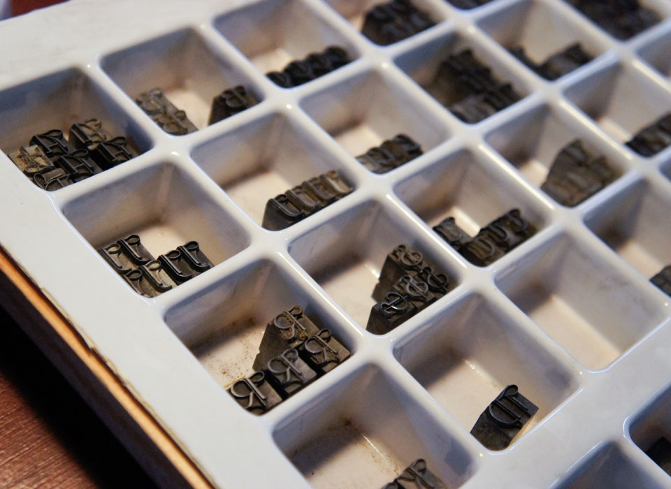
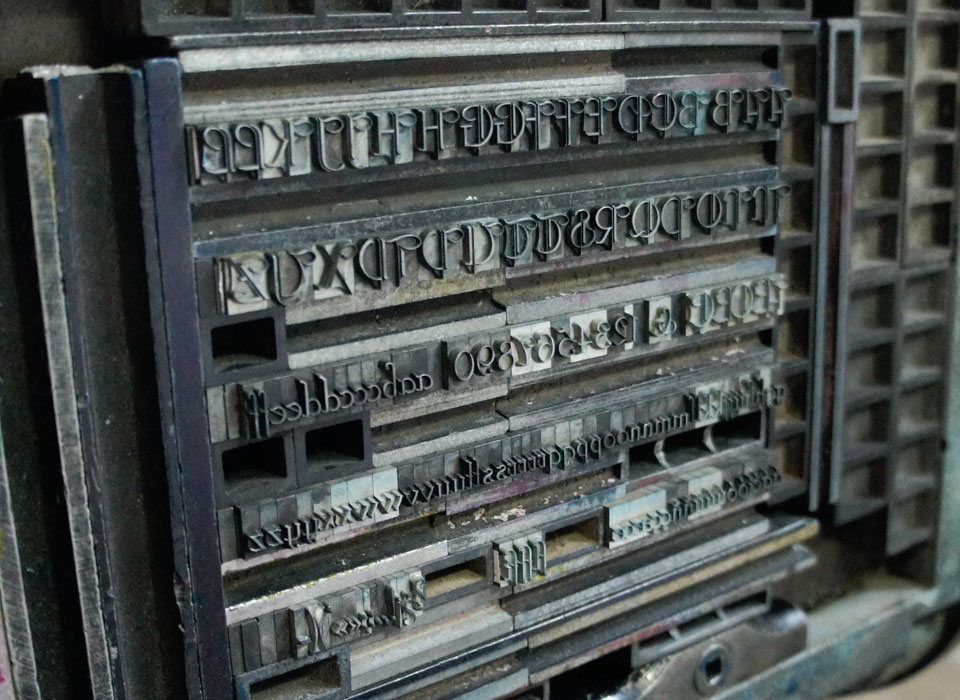
Composition with lead type
The first step of the project has been the choice and composition of lead letters.
Printing with the Boston Letterpress
Once compound the frame, the press is adjusted to ensure the best quality.
Scanning the printed material
Digitization of the prints created and prepare them to redraw.
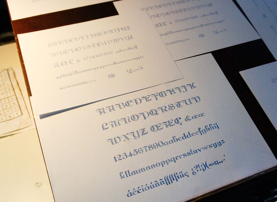
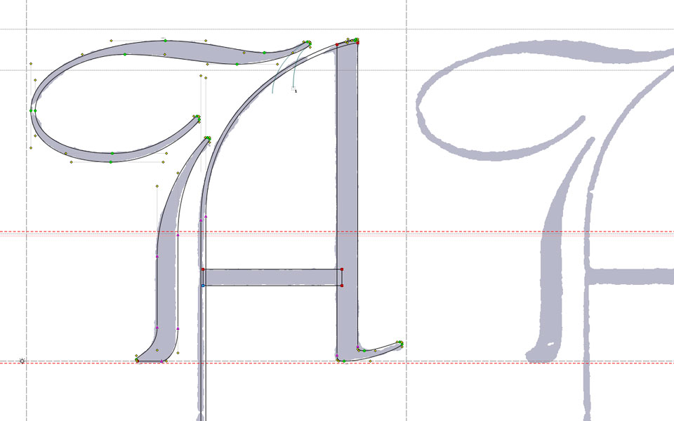
Drawing the glyphs with vectors
Redraw the character shapes with Bezier curves and make improvements.
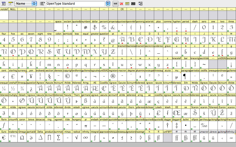
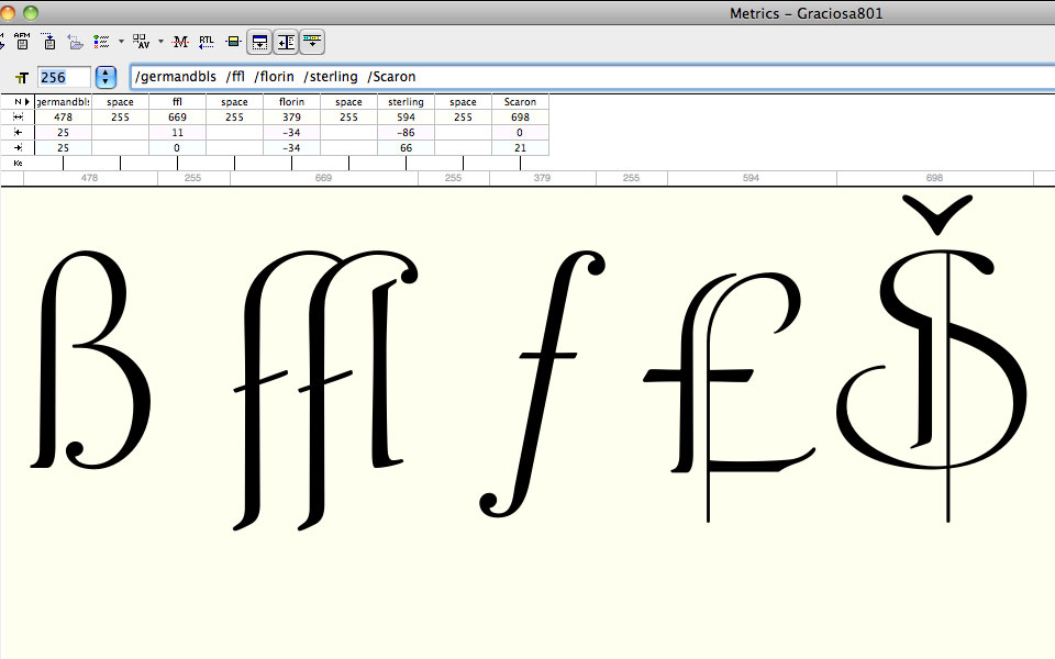
Creating nonexistent characters
Drawing nonexistent characters and symbols to supply the font with all characters for the use in 21 languages (OpenType Standard)
Creation of the font file for use with the computer
Characteristics of the font file like kerning and bitmap creation are defined and the font file is exported for his use with the computer.